Logo Variations
Brand Ribbons
Sub-Label
Usage proportions
Construction & Composition
Grid examples
Linguistic and copy principles
Layout
Spacious, serene, clean.
Healing Hands is a spacious, intimate, human and natural brand. Our layout rules reflect this and provide flexibility and options when laying out our visuals.
Our flexible layout structure enables content to be conveyed clearly and precisely, whilst still allowing for organic expression and graphic interest to be applied where necessary.
Our default setting should always be evoking "the strength within kindness" where our imagery, ( whether it is a simple, beautifully crafted studio shot, or a more location-driven shot ) should do a lot of the heavy lifting. Other graphic elements can be used sparingly as embellishments where needed.
The basic building blocks of layout are included here, however it is encouraged to find the best blend to showcase image and messaging based on the content ingredients and purpose at play.
For example, the most basic layout suggestion would be to lay a simple black or white logo over a beautiful brand image, centred. Perhaps with a supporting message. However, for a variety of reasons, including legibility, marketing fatigue, more complex messaging or to simply add interest, a variety of solutions have been included.
Basic layout
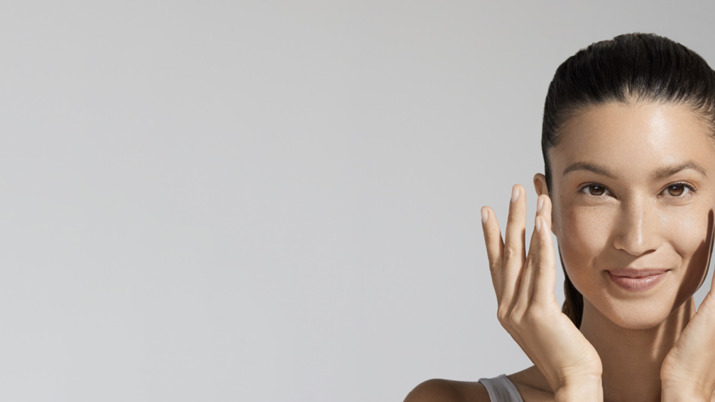
Our imagery, wether studio based or location, should do the heavy lifting for all of our visuals.
We recommend our basic first principal layout to follow the below. Let the image breathe, create interesting crops and positionings, and place the logo within the negative spaces available. Ensure the logo feels routed in its place and ideally centralized.
Space Blocking
Where imagery requires it, block out some negative space, in a color sympathetic to the imagery, for the branding and messaging to be contained.
Other Formats.
Showing the use of the brand ribbon in conjunction with the main logo branding.
Pebbles
A series of organic shapes have been created, which have been named, 'Pebbles'. Use these as bugs to offer up information or offers. The organic shapes tie into the thoughtful, natural and tactile aspects of the brand.
The Good Karma Symbol
A new symbol has been developed as a device to connote Good Karma. It replaces heart symbols that have been used previously. It is based on the negative space found within the logo, and is a useful companion symbol to suggest " here is a sentiment we endorse". or " some loving advice ". This can be used as visual signifier to punctuate compelling observations or life-enhancing verbiage. This is absolutely not a logo, but is simply part of the visual layout toolbox.
Examples of a real-world use of the Good Karma Symbol, in this case some Social Media posts.


