Usage proportions
Construction & Composition
Grid examples
Linguistic and copy principles
Layout
Clear, clean and vivid.
Infinity is a dynamic, colorful and graphic brand. It follows that layout rules should have a degree of flex and dynamism baked in.
Our flexible layout structure enables content to be conveyed clearly and precisely, whilst still allowing for expression and graphic interest to be applied where necessary.
Our default setting should always be “Striking Minimalism” where possible, where our imagery, ( whether it is a simple, beautifully crafted studio shot, or a more concepted location image ) should do a lot of the heavy lifting, with other graphic elements used sparingly as embellishments where needed.
The basic building blocks of layout are included here, however it is encouraged to find the best ways to define image and messaging based on the ingredients and needs at play.
For example, the most basic layout suggestion would be to lay a simple black or white logo over an image, centred. However, for a variety of reasons, including legiibility, marketing fatigue, or to simply add interest, a variety of solutions have ben included.
You will be taken through each one.
Basic layout
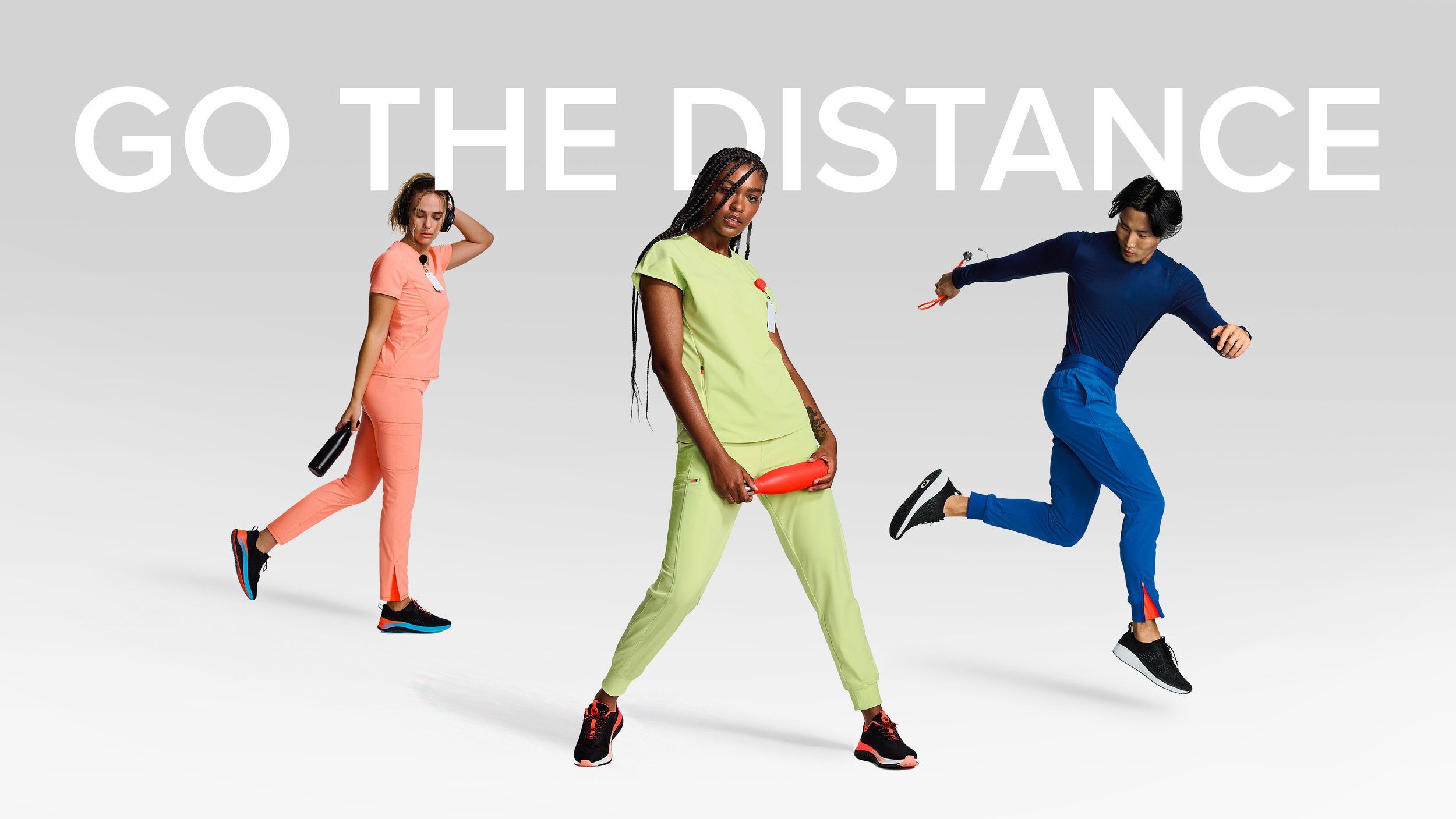
Our imagery, wether studio based to location, should do the heavy lifting for all of out visuals.
We recommend out basic first principal layout to follow the below. Let the image breathe, create interesting crops, and place the logo within the negative spaces available. Ensure the logo feels routed in its place (so not slightly left of centre or scraping the edge). Make it feel solidly upper left quadrant, or lower right, and manipulate the image to fit.
Download
Lorem ipsum dolor sit amet, consectetur adipiscing elit, sed do eiusmod tempor incididunt ut labore et dolore magna aliqua. Ut enim ad minim veniam, quis nostrud exercitation ullamco laboris nisi ut aliquip ex ea commodo consequat.
Diptychs
An example showing how we can pair images as a diptych - one full crop and the companion image showing a detail from the same product. This is also a useful way to drop the tagline over the detail image, but treated as messaging rather than a lock up with the logo.
Occasional treatments to add visual interest
On occasion where appropriate and required, graphic treatments can be used. Seen here is a masked out image using the logo mark, to create am edgy, glitched type look.
Use blown up areas of the brand logo mark, to create geometric graphic elements to add depth, color and interest to imagery, where needed.
Some executions showing how layout rules can be used to create clean, fresh imagery yet with added color and graphics where needed.


